The Strategy

Core Brief
Technical Stack
Logo Anatomy: Warmth meets Luxury
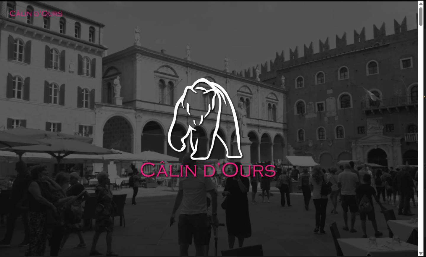
The Câlin d’Ours logo is a careful balance between the softness of a bear and the luxury of a premium brand. I chose a minimalist line icon that is both elegant and approachable. The typography is a modern serif that exudes class, while the color choices suggest warmth and comfort. This logo is designed to work perfectly on everything from small bottle labels to large-scale embroidery on fashion merchandise.
Editorial E-Commerce: Digital Storefront
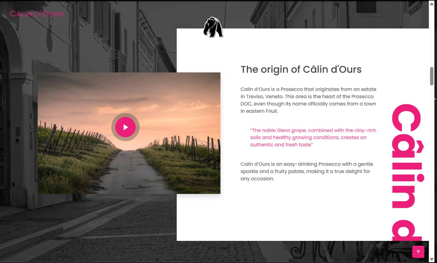
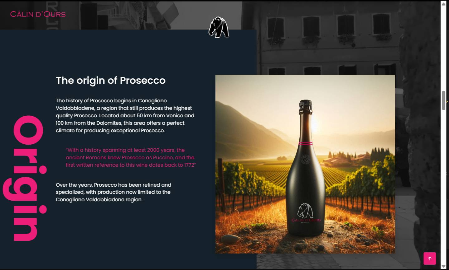
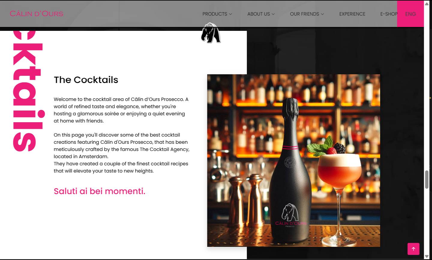
For the website, I designed an editorial-style layout that feels more like a lifestyle magazine than a standard shop. Using large white spaces, fluid animations, and high-quality photography, visitors are immersed in the brand world. Built with Bootstrap, the design emphasizes thumb-friendly mobile navigation, ensuring a flawless shopping experience for a fashion-conscious audience.
The Brand Manual: Guarding Consistency
To ensure growth, I developed a comprehensive Brand Manual. This document defines all rules for typography, color usage, and tone of voice. Whether it’s a digital ad, physical packaging, or new merchandise, the visual integrity remains intact. This systematic approach ensures the brand makes a professional impression at every touchpoint, which is essential for building loyalty for a new startup.